In this layout overview we’ll be taking a look at Layout Glow that you can find inside your app builder.
Here are the sections of this guide for quick reference.
Homepage Options
Layout Options
Previewing The Layout
Homepage Colors
Like with any other layout, you can choose to use this option from the layouts options panel by clicking the green change layout button from the homepage of the app builder when you are editing an app.

Homepage Options
This particular layout does not offer any homepage options.
Layout Options
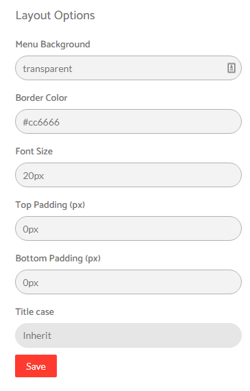
There are a few layout options within this layout template.
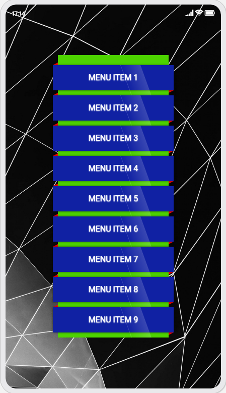
You can customise the menu background color by adding the hex code you wish to use, please note that this is the section behind the menu that the menu items are wrapped around and not the boxes the menu items are contained within, this is controlled by the colors option panel referenced at the end of this tutorial. You can see we’ve used a light green color in our example in the preview section.
You can set a border color for the ribbons containing the menu items as you’ll see in our preview image below we used red to make it stand out.
You can select the font size for the menu items.
You can set a custom Top & Bottom Padding pixel value in the fields to determine how much space you want to use above and below the hex menu design.
You can also choose a title case that best meets your needs for the app design.
Layout Options

Previewing The Layout
Here’s a quick look at the how the app looks with this layout.
Application Homescreen Example

Homepage Colors
Please note that all color changes for the homepage are found under the main left menu, under Colors and then select the Homepage option.

