In this video below we’ll give you an overview of the Global Colour Panel.
The app builder uses global colours to set through the entire application so changes you make here will change all connected sections to the colour option you are changing.
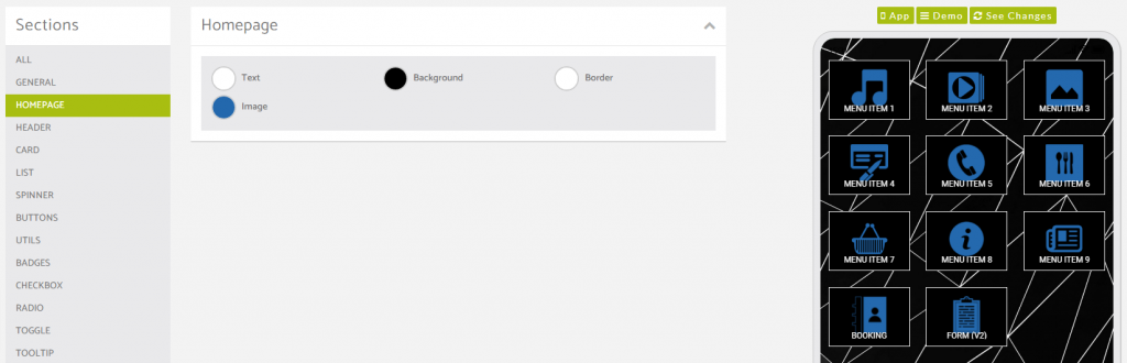
Homepage Colour Options
Here’s an example of how the colour choices here display in the app.
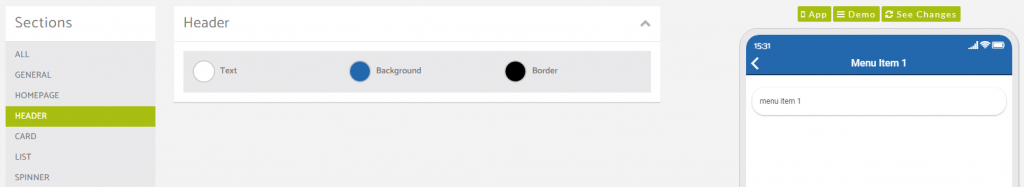
Header Colour Options
Here’s an example of how the colour choices here display in the app.
This is for the top section of the app that contains the back arrow, the feature title and sometimes another option in the top right dependent on the feature it is displayed on.
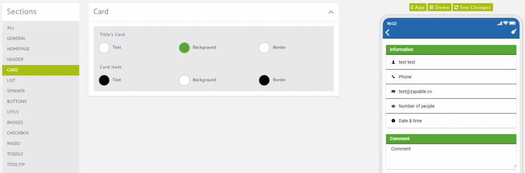
Card Colour Options
Here’s an example of how the colour choices here display in the app.
In this example screenshot shown below, we have used the booking feature, and changed the design setting to the Card option. Some features will allow you to choose between a Card or a List design (list colour options shown below).
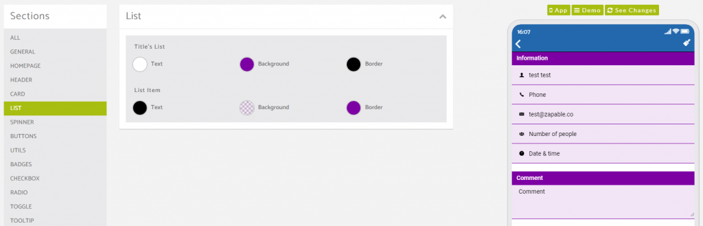
List Colour Options
Here’s an example of how the colour choices here display in the app.
In this example screenshot shown below, we have used the booking feature, and changed the design setting to the List option. Some features will allow you to choose between a Card or a List design (Card colour options shown above).
Spinner Colour Options
This colour options panel is specifically for native applications only and so the app user would need the app installed via either the Google Play Store or the Apple App Store for this spinner to be visible.
This spinner is seen when pages are loading such as changing from a feature back to the home page or vice versa, or when a feature is loading an action requested within it.
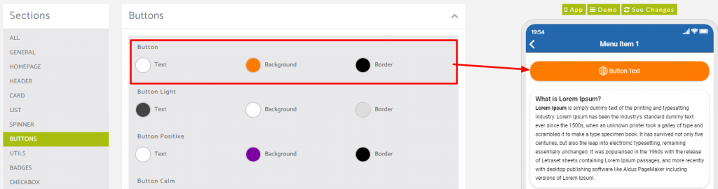
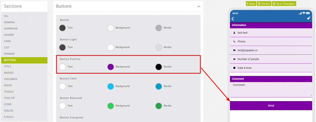
Buttons Colour Options
Here’s an example of how the colour choices here display in the app.
The first button option we’ll cover is the Button choice within the buttons panel.
This changes the buttons added to a custom page.
The second button option we’ll cover is the Button Positive choice within the buttons panel.
This changes the buttons found by default within features such as the Booking feature.
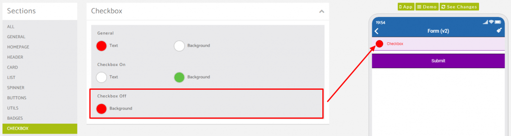
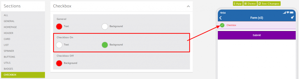
Checkbox Colour Options
Here’s an example of how the colour choices here display in the app.
In our example in the screenshot below we have used the checkbox options field found in the Form feature.
You have the ability to change the unchecked option colour and also the checked colour too.
Checkbox fields will appear inside various options within features inside the app builder.
Here’s a preview of an unchecked checkbox.
and here is an example of a checked checkbox.
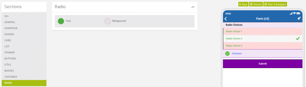
Radio Options Colour Options
Here’s an example of how the colour choices here display in the app.
In our example in the screenshot below we have used the radio options field found in the Form feature.
Radio fields will appear inside various options within features inside the app builder.
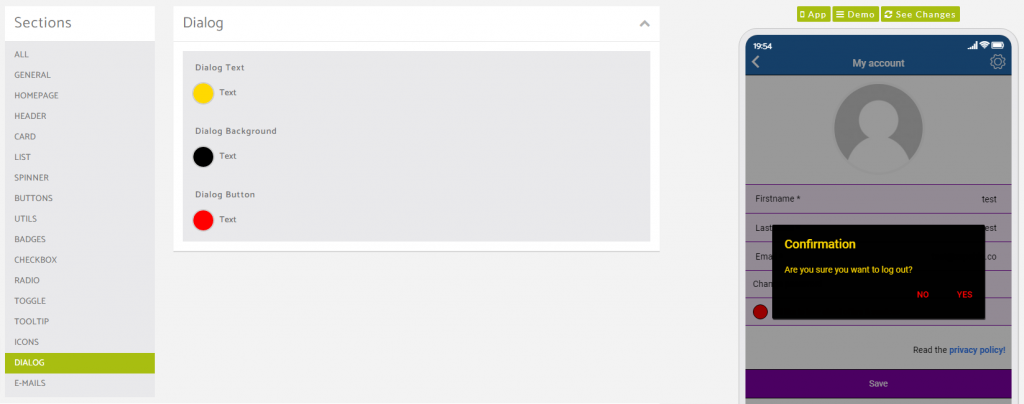
Dialog Colour Options
Here’s an example of how the colour choices here display in the app.
This colour option is specific to the pop up dialog prompts that appear based on actions taken in app.