The form fields builder is separated into two different sections, with the first set of options being the formatting elements (details above) and the second part which are the input elements, which we will cover in this section.
In the input elements located at the bottom part of the dropdown when the type field dropdown option is selected you will see the following:
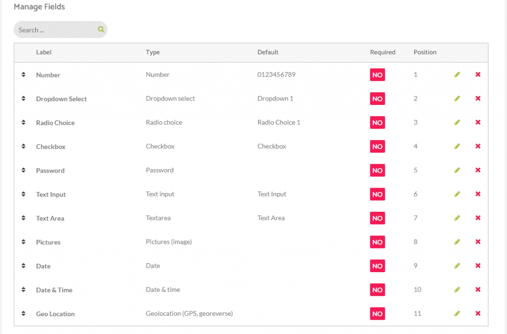
– Number: adds a number input with options, minimum, maximum & step increment
– Dropdown Select: adds a select element with multiple options
– Radio Choice: adds a radio input choice
– Checkbox: adds a simple checkbox element
– Password: adds a password text element, input text is not readable
– Text Input: a single line text input
– Text Area: a multiline text input
– Pictures: allows user to send up to 10 images, the limit can be configured individually for each picture input, as long as the placeholder texts
– Date: simple date field, with format options & weekdays restriction
– Date & Time: simple date & time field, with format options & weekdays restriction
– Geo Locations: a clickwrap action, when the users check the box, it’s location is saved and georeversed (the georeverse api requires a google maps api key)
Here you can see them all enabled in the below image.