In this layout overview we’ll be taking a look at Layout 12 Metro that you can find inside your app builder.
Here are the sections of this guide for quick reference.
Homepage Options
Layout Options
Previewing The Layout
Homepage Colors
Like with any other layout, you can choose to use this option from the layouts options panel by clicking the green change layout button from the homepage of the app builder when you are editing an app.
Homepage Options
This particular layout does not offer any homepage options.
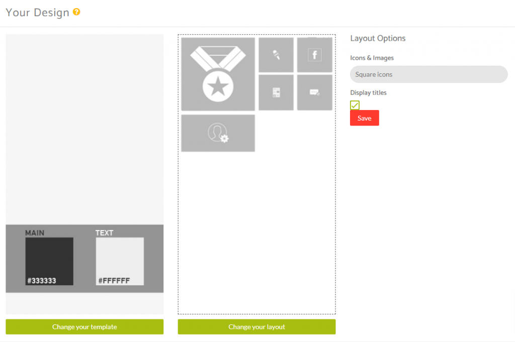
Layout Options
When you have features added to your application you can then see how this layout looks with the content you have in your application and then decide whether or not you want to customise it further using the Layout Options available for this particular layout.
Within the layout options you have the ability to decide whether you want to use the square icons or cover images for the feature tiles that are displayed.
Note: The cover image options can either be square images (equal height and width) or a 2:1 rectangle image (width is 2x the height) for proportions. The image size will depend on it’s location as you will see from the previews below.
You have the ability to display or hide the titles of of the features you have added to your application.
Previewing The Layout
Here’s a quick look at the how the app looks with this layout.
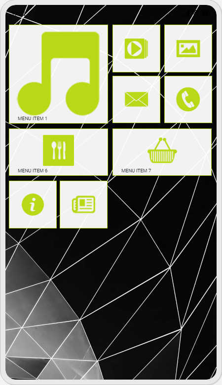
Application Homescreen Using Square Icons
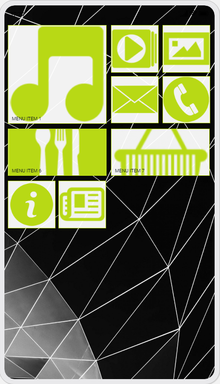
Application Homescreen Using Cover Images
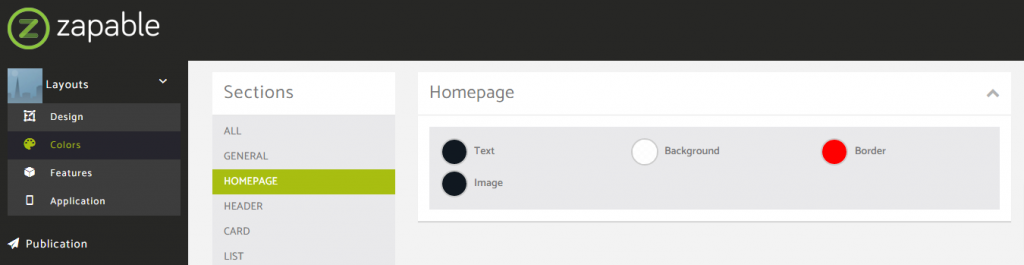
Homepage Colors
Please note that all color changes for the homepage are found under the main left menu, under Colors and then select the Homepage option.