In this layout overview we’ll be taking a look at Layout 3 Horizontal that you can find inside your app builder.
Here are the sections of this guide for quick reference.
Homepage Options
Layout Options
Previewing The Layout
Homepage Colors
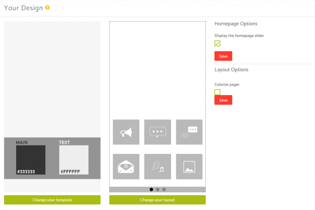
Like with any other layout, you can choose to use this option from the layouts options panel by clicking the green change layout button from the homepage of the app builder when you are editing an app.
Homepage Options
This particular layout allows you make some customisations to the view that you see from the homepage of the application.
You have the ability to add a homepage slider by checking the box to display this and then clicking save.
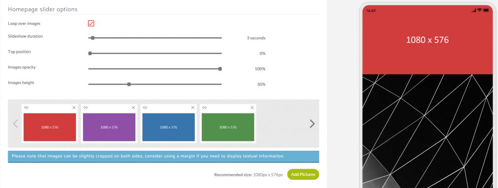
When the page reloads you’ll see an option beneath this section where you can add in your slider images.
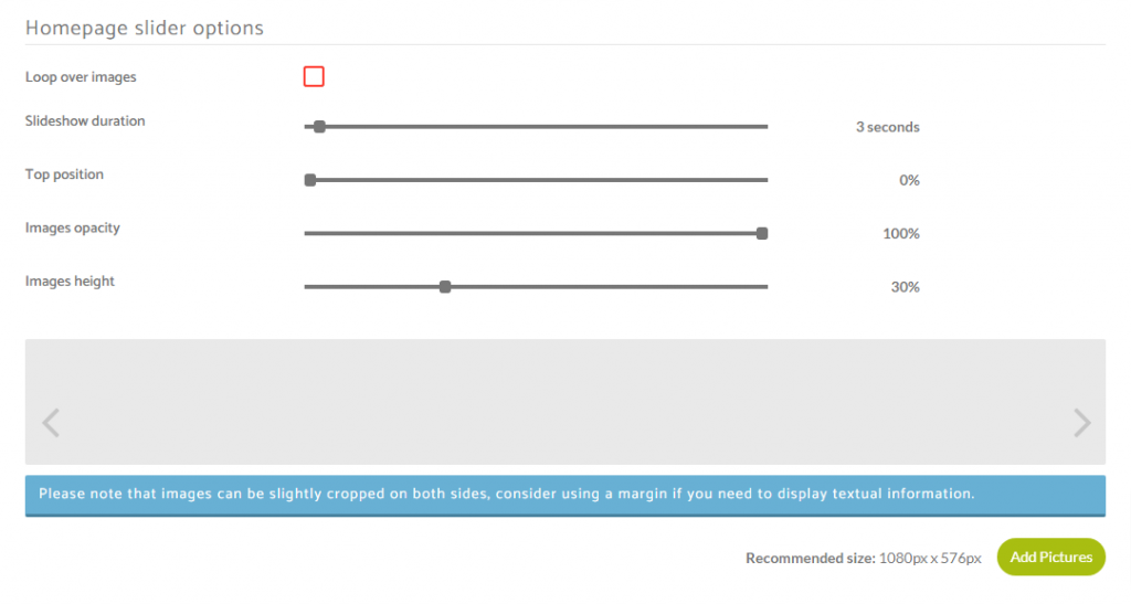
Here you can decide whether or not you want the slider to have the ability to loop over the images.
You can decide how long you want each slide to display on homescreen before changing to the next image in the slider series.
You can adjust the percentage from the top of the screen that you want the slider to start to display.
You can alter the opacity of the images you adding to make them the original upload through to completely transparent.
You can also adjust the percentage of the image display height within the viewing device.
To add an image to your slider, you can click the green Add Pictures button seen in the bottom right corner of the above image.
The recommended size for images is 1080px Wide by 576px High.
Please note: Because of the variation in screen sizes across multiple devices, images can be slightly cropped on both sides for some devices, so please consider using a margin on your image if you need to display textual information.
Layout Options
When you have features added to your application you can then see how this layout looks with the content you have in your application and then decide whether or not you want to customise it further using the Layout Options available for this particular layout.
Within the layout options you have the ability to Colorize the pager section.
This is the section found underneath your apps features on the home screen.
If you enable this, it will take on the same color used for the background used for behind your features icons under the home screen tab in the color panel.
If you enabled the above, and you wanted to change the color of the navigation dots in the pager area at the bottom of the app home screen you can add a code snippet to your SCSS panel found under the Colors tab on the left side menu.
Here’s the code snippet, just replace the hex color with your own.
/* Color Change Navigation Dots Homescreen */
.layout.colorize-pager .slider-pager-page {
    color: #ff0000;
}
Note: The second (or more) dot(s) will take on a transparent element do help the user determine which page the user is on within the navigation.
If you did not enable to Colorize option but instead still wanted to customise this bottom section to add your own background color for the pager section and your own custom color for the navigation dots, you can add the following code snippets into your SCSS panel.
Here’s the code snippet, just replace the hex color with your own.
/* Color Change Background Pager Section Homescreen */
.layout .slider-pager {
    background-color: #3875ad;
}

/* Color Change Navigation Dots Homescreen */
.slider-pager .slider-pager-page {
    color: #fff;
}
Previewing The Layout
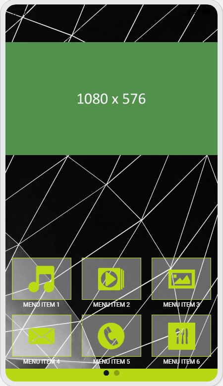
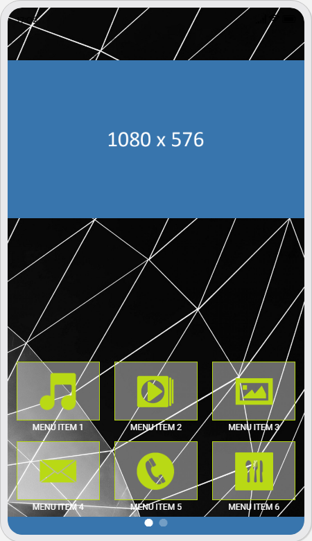
Here’s a quick look at the how the app looks with this layout.
Green & Black Pager Bar
Blue & White Pager Bar
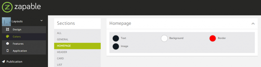
Homepage Colors
Please note that all color changes for the homepage are found under the main left menu, under Colors and then select the Homepage option.