In this layout overview we’ll be taking a look at Layout 69 that you can find inside your app builder.
Here are the sections of this guide for quick reference.
Homepage Options
Layout Options
Previewing The Layout
Homepage Colors
Like with any other layout, you can choose to use this option from the layouts options panel by clicking the green change layout button from the homepage of the app builder when you are editing an app.
Homepage Options
This particular layout does not offer any homepage options.
Layout Options
There are a few layout options within this layout template.
Layout Options
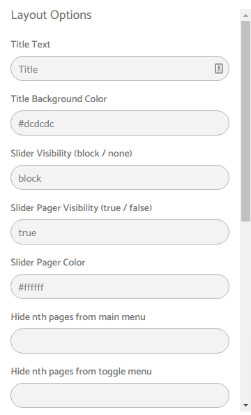
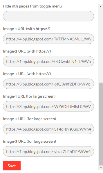
Layout Options
Layout Notes
- Slider has 3 slides which consists of first three features pages of an app. This means when you click on first slide then first feature app page will open, when you click on second/third slide then second/third feature app page will open.
- Slider Visibility: block = visible & none = hidden
- You can also enable/disable slider pager. (true = enable & false = disable)
- We have used 100% width in slider images and 250px height so for mobiles recommended slide image size is 500px*250 px and for larger screen like desktop recommended image size is 1000px*250px.
- Use only https:// in Image URL.
- For nth-child formula refer: http://nthmaster.com
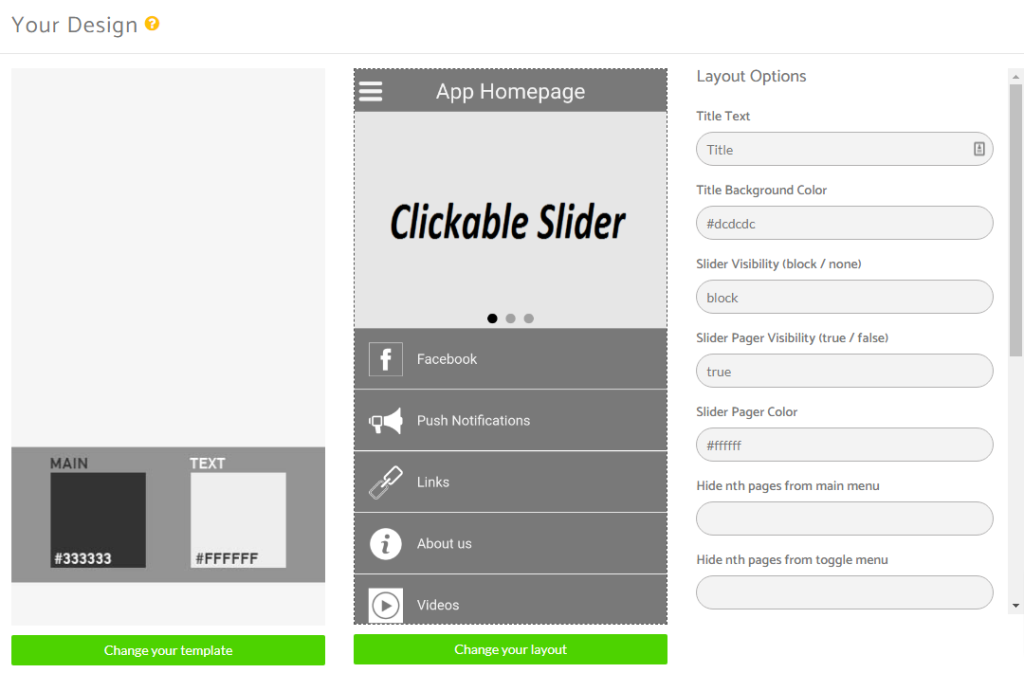
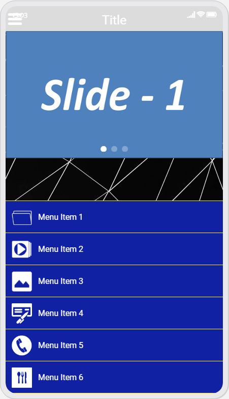
Previewing The Layout
Here’s a quick look at the how the app looks with this layout.
Application Homescreen Example
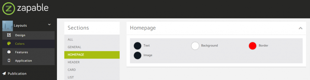
Homepage Colors
Please note that all color changes for the homepage are found under the main left menu, under Colors and then select the Homepage option.