
In this layout overview we’ll be taking a look at Layout Dream that you can find inside your app builder.
Here are the sections of this guide for quick reference.
Homepage Options
Layout Options
Previewing The Layout
Homepage Colors
Like with any other layout, you can choose to use this option from the layouts options panel by clicking the green change layout button from the homepage of the app builder when you are editing an app.
Homepage Options
This particular layout does not offer any homepage options.
Layout Options
When you have features added to your application you can then see how this layout looks with the content you have in your application and then decide whether or not you want to customise it further using the Layout Options available for this particular layout.
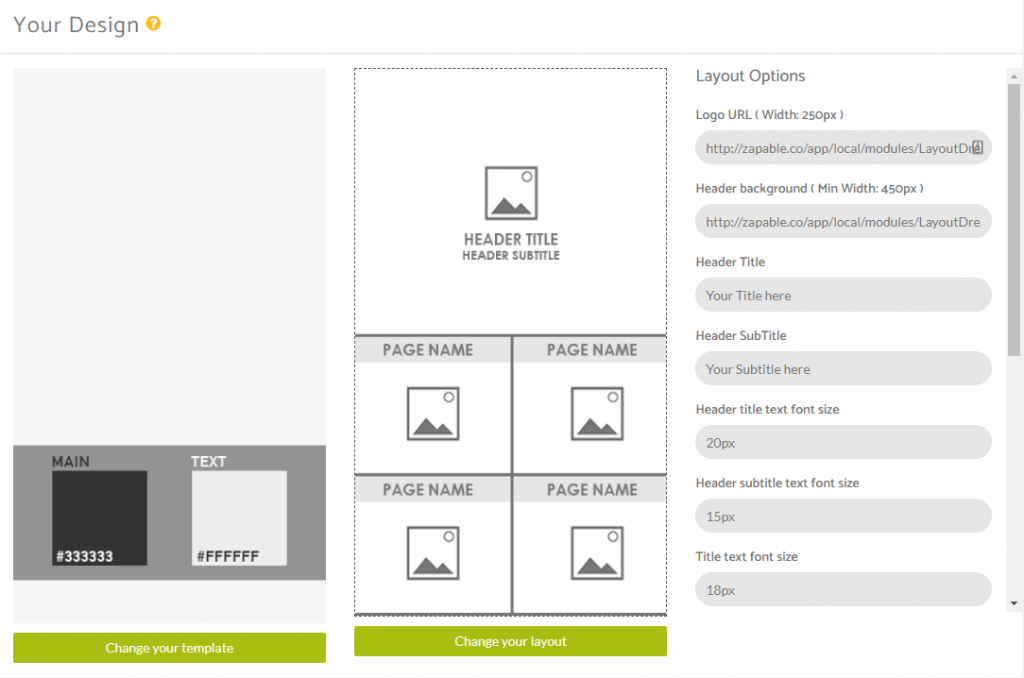
Logo and Background Image
This layout allows you to set a logo and a header background image. To do this you will need your images added via an external url such as a website (that you may be building the app for) or via an online storage provider like Amazon S3.
Add in the url’s for your images of choice or leave the fields blank to not show anything if you prefer.
The maximum width for the logo url is 250px.
The minimum width for the header background is 450px.
Header Title and Sub Title
You can also add in a Header Title and a Sub Title which will both appear under the logo section.
You can also determine the font size used here in pixels too.
Feature Titles
You can set the font size for your Feature Titles too by adjusting the Title Text Font Size Field.
You can change the title case between lower case, upper case and to capitalise the whole text.
You can also choose the overlay type between dark and light which changes the effect on the boxes that contain each feature.
Colour Panels
The final set opf options for this layout are colour panels.
In this section you can choose the colour for the following elements.
Header Title Text Color
Header Subtitle Text Color
Title Text Color
Border Color
If you make any changes to the above options panels, you will need to click the red save button at the bottom of the section and if needed, to see changes in the preview device, you can click the update and preview button beneath the preview device.
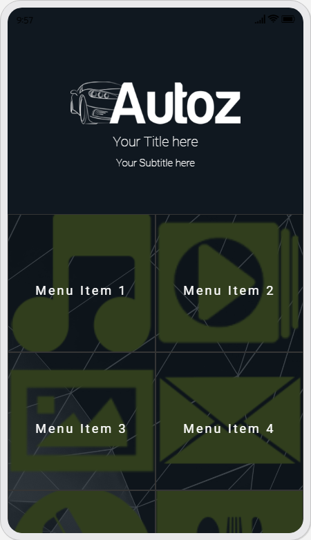
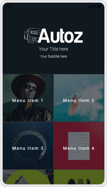
Previewing The Layout
Here’s a quick look at the how the app looks with this layout.
Application Homescreen Using Square Icons
Application Homescreen Using Cover Images
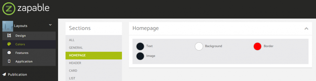
Homepage Colors
Please note that all color changes for the homepage are found under the main left menu, under Colors and then select the Homepage option.
CSS Customisations
There are some options you can customise within this particular layout to achieve a slightly different look or feel within the application.
To change the color of the overlay on the background image you can apply the following code, just changing the colour value to the one you want to use.
You need to add this to your css panel under the colors menu option.
.layout_dream_main .overlay {
background: #101820;
}
To change the colour of the overlay from between black or white you can set a specific colour to overlay the icons or background images, just change the colour value to the one you want to use.
You need to add this to your css panel under the colors menu option.
.layout_dream .dream_child .overlay {
    background: rgba(16,24,32,0.6);
}